Saturday, 30 April 2011

"With a pen like a scalpel and creativity at his tool Honarvar gives a beautiful view of the dark sides of humanity, which we would rather like to avoid."

ASHKAN HONARVAR
Is an iranian illustrator based in the Netherlands.
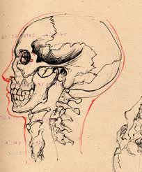
His work mostly involves faces and bodies, playing attention to the portrayal of faces.
It's very hard to actually find information about Ashkan, however going of his statement on his website i think the guy is a little bit of a genius. Honarvar's aim is to bring out the beauty in everything as he feels this can be easily lost through deformation, heartbreak and anger.
Honarvar is the artist i've been influenced most by for my fmp, what he manages to create with minimal effort is amazing. The concept behind his work is flawless.
The above image is from a series of portraits called 'Unnatural death', all the people in these images had their lives taken abruptly, either by stab wounds, posioning, beatings..etc. Some of the gold foil is to cover the wounds up, the rest of the foil flows out, representing the cause of death. (Simple, yet brilliant!)

His statement is well worth a read so check it out here
Or look through his portfolio here Ashkan Honarvar

You may look through his work and find that you're not overly keen as a lot of his work is photographs re-worked or images de-faced. This to some people could come across as quite cheap and easy, but the thought behind his effort is very good. You can't doubt that.

Thursday, 28 April 2011

FACES


For my fmp, I have decided to create my own theme, centered around faces and what defines a portrait. I find it quite interesting how we have become so fixated on identity and what defines us. Faces are at the forefront of all of this. 
My main aim is to research into faces, the structure, the symmetry and whether it is necessary for a face to define a portrait.
So far i've been  
experimenting with various illustration techniques on various surfaces to create a mixture of  illustrative portraits.
I also want to experiment with various make-up designs i have come up with.

Monday, 25 April 2011

IN BLOOM

Whilst browsing through my favourite blogs and sites today, this caught my eye.
The cover shoot photo for Illamasqua's spread in the recent Dazed and Confused issue. The spread was in aid of a brilliant competition Illamasqua are offering to young up and coming make-up artists.  To read the article and interview, along with the rest of the cover shoot photos, click here: Illamasqua

This is definitely floral i can get on board with.


Photography Roe Ethridge
Make-up Alex Box at D+V using Illamasqua
Model Juju at Nathalie Paris

Wednesday, 13 April 2011

Just My Type

My boyfriend knows i have a bit of a fascination with typefaces and thus, decided to buy me a book that is basically all about them. 'Just My Type' is a book of stories all about fonts and how they have slowly crept their way into our soceity. You may think a book that is essentially font based is pointless or boring, but they pop into our lives every day and we're constantly bombarded with typefaces.
You identify IKEA with it's bold wide text (the font is Verdana)
But that was only a recent change, this caused a lot of uproar as Verdana is a font created by Microsoft, designed for screen not paper.

If you read a funny joke in a card, chances are the font is Comic Sans. Why? Well because
Comic Sans is essentially a polished version of a seven-year olds handwriting. It's slightly curved, fun and popular in children's books.

When Barack Obama was leading his Presidential campaign, the font used for leaflets, banners, flags etc was Gotham. This font has now found it's way into official government  projects, such as the 2010 U.S census.

Sunday, 10 April 2011

Hallo Amsterdam.

This post has been saved for a little over a week, so i thought i should probably publish it as I've been back from Amsterdam for over two weeks now.
I was very lucky to visit the capital of dutch land for a couple of days. I have been a lot of places in Europe, but I'd never ventured to the east before, so it was really refreshing to see how it differs from central Europe. The place as a whole was beautiful. The canals running straight through the city, the magnificent architecture from the Church of St Nicholas, to the Rijksmuseum and even the simplicity of people strolling with bicycles only added to the city's charm.

Thursday, 31 March 2011

I BRAKE EVERYTHING

Anthony Micallef is one of my favourite contemporary artists. His art is seen to be very brash and to some distasteful, but retains that edge and you can still brand his work 'pretty'. He has been heavily compared to Francis Bacon, which i can definitely see.
This is one of, if not my favourite piece of his. It combines a perfect mixture of dark,
thought provoking illustrative imagery that is centered around such a strong subject: Love.

Friday, 11 March 2011

MEDICAL ILLUSTRATION

I have always been interested in Anatomy. I love finding out how the body works and i'm fascinated with organs. I think it's wonderful how these illustrations show the intricate detail of what our body goes through and how these illustrations manage to represent a process we cannot see for ourselves. I think medical illustration is fantastic. It's creative. It's something as an artist you have to do justice, you're visualising a process after all.